我希望实现这样的目标 –
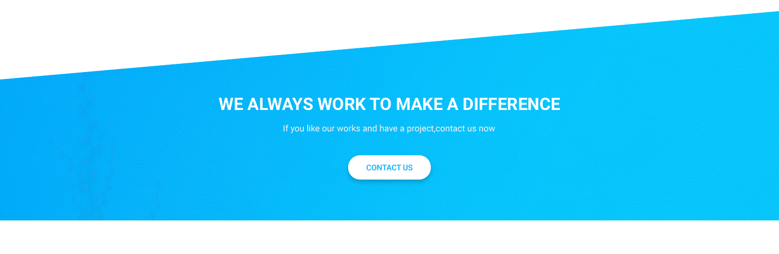
它有一个背景
image.我只能像这样做一个倾斜的div-
.shape {
  position: relative;
  width: 100%;
  height: 290px;
  background: rgba(6, 180, 248, 1);
}

.shape:after {
  position: absolute;
  width: 100%;
  height: 100%;
  content: "";
  background: inherit;
  top: 0;
  right: 0;
  bottom: 0;
  left: 0;
  transform-origin: top left;
  transform: skewY(-4deg);
}
<br><br><br>
<section class="container">
<div class="shape">
</div>
</section>但是如何使背景图像变得透明?谁能帮帮我吗
最佳答案 在这里我尝试了这个例子,我希望这会对你有所帮助,只需在html页面中复制整个代码并查看输出…,或者在下面看到它的代码片段
	.hero img {
    -webkit-clip-path: polygon(0 0, 100% 0, 100% 96%, 0 100%);
          clip-path: polygon(0 0, 100% 0, 100% 96%, 0 100%);
     }

     .promo {
      -webkit-clip-path: polygon(0 0, 1600px 0, 1600px 87%, 0 100%);
          clip-path: polygon(0 0, 1600px 0, 1600px 87%, 0 100%);
}

.hero {
  color: #fff;
  font-family: 'Fira Sans', sans-serif;
  position: relative;
  text-align: center;
  text-shadow: 0px 0px 1px rgba(0, 0, 0, 0.5);
}
.hero img {
  width: 100%;
}
.hero figcaption {
  left: 50%;
  position: absolute;
  top: 50%;
  -webkit-transform: translate(-50%, -50%);
          transform: translate(-50%, -50%);
  width: 100%;
}
.hero h1 {
  font-size: 32px;
}
.hero p {
  font-size: 14px;
  font-weight: 300;
  margin-top: 0.5em;
}

.promo {
  background: url(https://unsplash.it/1600/900?image=830) no-repeat;
  background-size: cover;
  color: #fff;
  font-family: 'Fira Sans', sans-serif;
  margin: 50px 0;
  overflow: hidden;
  padding: 150px 20px;
  position: relative;
  text-align: center;
  text-shadow: 0px 0px 1px rgba(0, 0, 0, 0.5);
}
.promo h1 {
  font-size: 32px;
}
.promo p {
  font-size: 14px;
  font-weight: 300;
  margin-top: 0.5em;
}

.quote {
  background: #41ade5;
  position: relative;
  z-index: 1;
}
.quote:before, .quote:after {
  background: inherit;
  content: '';
  display: block;
  height: 50%;
  left: 0;
  position: absolute;
  right: 0;
  z-index: -1;
}
.quote:before {
  top: 0;
  -webkit-transform: skewY(1.5deg);
          transform: skewY(1.5deg);
  -webkit-transform-origin: 100% 0;
          transform-origin: 100% 0;
}
.quote:after {
  bottom: 0;
  -webkit-transform: skewY(-1.5deg);
          transform: skewY(-1.5deg);
  -webkit-transform-origin: 100%;
          transform-origin: 100%;
}

.quote {
  color: #fff;
  font-family: 'Fira Sans', sans-serif;
  margin: 50px 0;
  padding: 20% 20px;
  text-align: center;
}

h1 {
  font-size: 32px;
  font-weight: 500;
}

.edge--bottom {
  position: relative;
  z-index: 1;
}
.edge--bottom:after {
  background: inherit;
  content: '';
  display: block;
  height: 50%;
  left: 0;
  position: absolute;
  right: 0;
  z-index: -1;
}
.edge--bottom:after {
  bottom: 0;
  -webkit-transform: skewY(-1.5deg);
          transform: skewY(-1.5deg);
  -webkit-transform-origin: 100%;
          transform-origin: 100%;
}

.edge--bottom--reverse {
  position: relative;
  z-index: 1;
}
.edge--bottom--reverse:after {
  background: inherit;
  content: '';
  display: block;
  height: 50%;
  left: 0;
  position: absolute;
  right: 0;
  z-index: -1;
}
.edge--bottom--reverse:after {
  bottom: 0;
  -webkit-transform: skewY(1.5deg);
          transform: skewY(1.5deg);
  -webkit-transform-origin: 0 100%;
          transform-origin: 0 100%;
}

.edge--top {
  position: relative;
  z-index: 1;
}
.edge--top:before {
  background: inherit;
  content: '';
  display: block;
  height: 50%;
  left: 0;
  position: absolute;
  right: 0;
  z-index: -1;
}
.edge--top:before {
  top: 0;
  -webkit-transform: skewY(1.5deg);
          transform: skewY(1.5deg);
  -webkit-transform-origin: 100% 0;
          transform-origin: 100% 0;
}

.edge--top--reverse {
  position: relative;
  z-index: 1;
}
.edge--top--reverse:before {
  background: inherit;
  content: '';
  display: block;
  height: 50%;
  left: 0;
  position: absolute;
  right: 0;
  z-index: -1;
}
.edge--top--reverse:before {
  top: 0;
  -webkit-transform: skewY(-1.5deg);
          transform: skewY(-1.5deg);
  -webkit-transform-origin: 0 0;
          transform-origin: 0 0;
}

.edge--both {
  position: relative;
  z-index: 1;
}
.edge--both:before, .edge--both:after {
  background: inherit;
  content: '';
  display: block;
  height: 50%;
  left: 0;
  position: absolute;
  right: 0;
  z-index: -1;
}
.edge--both:before {
  top: 0;
  -webkit-transform: skewY(1.5deg);
          transform: skewY(1.5deg);
  -webkit-transform-origin: 100% 0;
          transform-origin: 100% 0;
}
.edge--both:after {
  bottom: 0;
  -webkit-transform: skewY(-1.5deg);
          transform: skewY(-1.5deg);
  -webkit-transform-origin: 100%;
          transform-origin: 100%;
}

.edge--both--reverse {
  position: relative;
  z-index: 1;
}
.edge--both--reverse:before, .edge--both--reverse:after {
  background: inherit;
  content: '';
  display: block;
  height: 50%;
  left: 0;
  position: absolute;
  right: 0;
  z-index: -1;
}
.edge--both--reverse:before {
  top: 0;
  -webkit-transform: skewY(-1.5deg);
          transform: skewY(-1.5deg);
  -webkit-transform-origin: 0 0;
          transform-origin: 0 0;
}
.edge--both--reverse:after {
  bottom: 0;
  -webkit-transform: skewY(1.5deg);
          transform: skewY(1.5deg);
  -webkit-transform-origin: 0 0;
          transform-origin: 0 0;
}

.-berry {
  background: #b52b4a;
}

.-blue {
  background: #41ade5;
}

.-orange {
  background: #de6628;
}

.-green {
  background: #5e9b42;
}

.block {
  color: #fff;
  font-family: 'Fira Sans', sans-serif;
  margin: 0 0 200px;
  padding: 20% 20px;
  text-align: center;
}

h1 {
  font-size: 32px;
  font-weight: 500;
}

p {
  font-size: 14px;
  font-weight: 300;
  margin-top: 0.5em;
}
<div class="hero">
<figure>
<img src="https://unsplash.it/1600/900?image=830" /><figcaption>
<h1>
Angled Edge
</h1>
<p>
Image with CSS clip-path
</p>
</figcaption>
</figure>
</div>
<div class="promo">
<h1>
Angled Edge
</h1>
<p>
CSS background with CSS clip-path
</p>
</div>
<div class="quote">
<h1>
Angled Edges
</h1>
<p>
With 2 Pseudo Elements
</p>
</div>
<div class="block -berry edge--bottom">
<h1>
Bottom Angled Edge
</h1>
</div>
<div class="block -blue edge--bottom--reverse">
<h1>
Bottom Angled Edge
</h1>
<p>
Reversed
</p>
</div>
<div class="block -berry edge--top">
<h1>
Top Angled Edge
</h1>
</div>
<div class="block -blue edge--top--reverse">
<h1>
Top Angled Edge
</h1>
<p>
Reversed
</p>
</div>
<div class="block -orange edge--both">
<h1>
Top & Bottom Angled Edges
</h1>
</div>
<div class="block -green edge--both--reverse">
<h1>
Top & Bottom Angled Edges
</h1>
<p>
Reversed
</p>
</div>