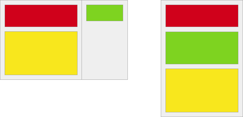
我有一个响应式网站,在大型浏览器窗口中有两列布局.目前使用float实现了两列布局.在较小的屏幕上,我想只有一列.另一列的内容应显示在主列的两个元素之间,如下所示:
<div class="two-columns">
  <div class="main-column">
    <div class="red-element"></div>
    <div class="yellow-element"></div>
  </div>
  <div class="sidebar-column">
    <div class="green-element"></div>
  </div>
</div>
我尝试使用基于弹性盒的方法,基本上是the one described in this question,但是当flex-direction是列时,flex似乎仍然不支持Safari.由于Safari是我访问者的主要浏览器,因此必须获得正确的Safari支持.
有没有一种方法可以使用CSS实现,而无需在我的标记中放置绿色元素两次?
最佳答案 这是使用一个flex容器的一般解决方案:
<div class="container">
    <div class="box"> ... </div><!-- red box -->
    <div class="box"> ... </div><!-- green box -->
    <div class="box"> ... </div><!-- yellow box -->
</div>
从小屏幕开始(无特殊原因),将它们堆叠在一列中:
.container {
    display: flex;
    flex-direction: column;
}

.box {
    height: 100px;
    width: 100%;
}
重新布置更宽屏幕的布局:
@media (min-width: 800px) {

   .container {
        flex-direction: row;
        flex-wrap: wrap;
    }

    .box {
        flex-basis: 45%;
    }
}
在宽度超过800px的屏幕上,容器将项目排成一行并启用包装.每个盒子都有足够大的宽度(柔性基础),只有两个适合在一条线上.
完整演示:
* {
    box-sizing: border-box;
}

.container {
    display: flex;
    flex-direction: column;
    padding: 5px 0;
    background-color: #f5f5f5;
    border: 1px solid #aaa;
}

.box1 { background-color: red; }
.box2 { background-color: lightgreen; }
.box3 { background-color: yellow; }

.box {
    height: 100px;   /* `flex-basis: 100px` would also work */
    width: calc(100% - 20px);
    margin: 5px 10px;
    border: 1px solid #ccc;
    display: flex;
    justify-content: center;
    align-items: center;
    font-size: 1.2em;
}

@media (min-width: 800px) {
    .container {
        flex-direction: row;
        flex-wrap: wrap;
    }
    .box {
        flex-basis: 45%;
    }
}
<div class="container">
<div class="box box1"><span>1</span></div>
<div class="box box2"><span>2</span></div>
<div class="box box3"><span>3</span></div>
</div>从你的问题:
…but
flex-basisstill seems to be unsupported in Safari whenflex-directioniscolumn
我不确定这是否正确(caniuse.com).
但是,您始终可以使用width或height属性而不是flex-basis(更多详细信息:What are the differences between flex-basis and width?).